
GRATIS
University of Michigan vía Coursera
GRATISAdvanced Styling with Responsive Design

Cursos gratis (Auditar)


Inglés

NaN

Guía de Registro en Coursera

Acerca de este curso
Compártelo


- Week One: Style with Responsive Design
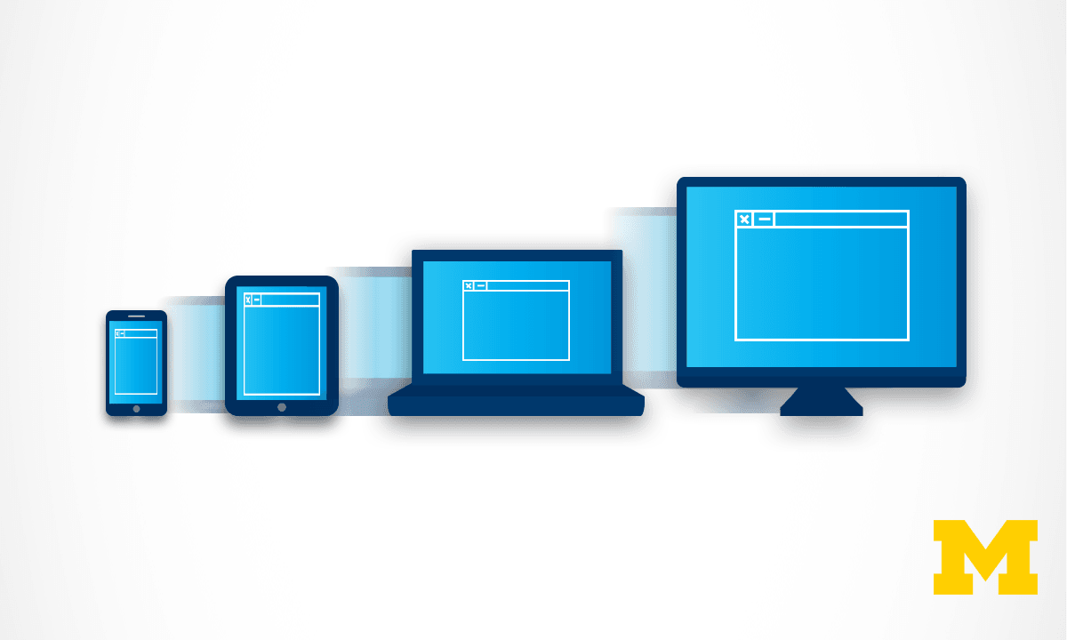
- What does it mean to have responsive design for your site? How can you tell if your existing site is responsive? This week we will begin with the theories behind the "mobile-first paradigm" - the idea that your mobile site should provide everything needed, not a pared-down version of a good page. We end the week by taking the first concrete step of using fluid measurements in your CSS.
- Week Two: Basic Concepts
- This week you will get a chance to put the theories into practice using media queries in your CSS. These queries can automatically change the look and functionality of your site based on the size of the browser being used to view the page. This allows you to decide what type of look you want to achieve at various screen sizes, also called "viewports".
- Week Three: Media Queries for Layout and Accessibility
- Knowing what your want your site to look like is the first step, but actually writing the code is another. This week we look at the grid and flex display properties to suggest ways to organize the layout of your page. We also talk about media queries that you should be including to increase the accessibility of your page. These queries can react to user preferences about color schemes, animation, and more.
- Week Four: Frameworks
- After every good programmer has put in time creating sites from scratch, it is common to utilize existing tools out there. After all, why recreate the wheel? The work you have done up to this point will give you the knowledge needed to craft your own unique sites from these frameworks. This week we will work with Bootstrap, a framework that uses HTML5, CSS, and JavaScript (but don't worry if you have never used JavaScript yourself).
Cursos relacionados

GRATIS Aprendiendo a aprender: Poderosas herramientas mentales…

Deep teaching solutions

Español
GRATIS Programación para todos (Introducción a Python)
University of Michigan
Inglés
GRATIS The Science of Well-Being
Yale
Inglés

GRATIS Negociación exitosa: Estrategias y habilidades esenciales
University of Michigan
Inglés

GRATIS Primeros Auxilios Psicológicos (PAP)
Universitat Autónoma de Barcelona
Español

GRATIS Chino para principiantes
Peking University
Inglés
¿Te apetece valorar
nuestra web?
4.3 / 5 ( 3432 votos )
¿Preparado para tu próximo proyecto laboral?
Copyright © 2022 Mooc. Todos los derechos reservados